
Arranging an interior is no longer just about choosing a sofa and a wall color. Energy constraints, low-carbon materials, and augmented reality visualization tools are reshaping the way we design a living space. Decorating with style now involves merging aesthetics with technical parameters that traditional guides often overlook.
Interior Design and Energy Constraints: The Forgotten Parameter
Since the tightening of the Climate and Resilience law and the gradual ban on renting the most energy-intensive homes, interior decoration has absorbed questions that were once solely the domain of energy performance diagnostics. The positioning of furniture in relation to heat or cooling sources directly affects the perceived comfort, without touching the thermostat.
Read also : Ideas and Inspirations for a Zen and Stylishly Decorated Home
For example, placing a sofa against a poorly insulated wall creates a sensation of coldness that even beautiful textiles cannot correct. Conversely, clearing the area around a radiator or a ventilation outlet improves thermal diffusion without technical intervention. The arrangement of furniture influences the perceived temperature as much as the heating itself.
Resources like mamaison.info allow for the intersection of these practical considerations with design ideas suited to different housing configurations.
You may also like : The Secrets to a Successful Wedding: Tips, Ideas, and Inspirations for Your Big Day
Summer comfort is also becoming a key criterion for decoration. Thermal blackout curtains, thick linen shades, or tightly woven sheers filter sunlight without plunging the room into darkness. Choosing a thermoregulating textile for a southwest-facing window is as much about style as it is about energy performance.
Low-Carbon Materials and Decoration: How Eco-Designed Furniture Changes Style Choices
Major furniture brands now offer FSC or PEFC certified ranges and low-VOC paints. This evolution is not just a marketing argument. The choice of eco-designed furniture steers aesthetics towards more raw finishes, lightly treated light woods, and natural color palettes.
A certified solid oak piece does not have the same appearance as a melamine panel covered with a wood imitation decor. The texture, grain, and color variations create a visual presence that industrial reproductions cannot replicate. For those seeking a characterful interior, this material dimension is as important as the form.
Low-Impact Paints and Coatings
Biosourced or low-VOC paints have multiplied in catalogs over the past two years. Their visual uniqueness often lies in a deeper matte finish and a palette that favors mineral tones. These shades naturally harmonize with furniture made from raw materials, facilitating the overall coherence of a room.
- Clay-based paints offer a velvety appearance that absorbs light instead of reflecting it, ideal for an east-facing bedroom or office.
- Lime coatings, used in kitchens or bathrooms, provide an irregular texture that breaks the monotony of smooth walls.
- Plant-based lacquers, less common, are suitable for woodwork and furniture to be renovated when one wants to avoid petrochemical solvents.
Combining a low-carbon material with a coherent color produces a more homogeneous result than layering decorative elements without any connection.
Augmented Reality and Interior Decoration: Test Before You Buy
Augmented reality applications offered by several furniture brands allow you to project a piece of furniture or a light fixture directly into your room using your phone’s camera. The tool is not new in principle, but the accuracy of the renderings has progressed to the point of changing the way purchasing decisions are made.
Visualizing an armchair in your living room at full size, with the ambient lighting of the room, reduces the risk of error regarding proportions. The majority of returns for furniture purchased online are due to size issues, not quality. The AR tool addresses this specific point.
Current Limitations of AR Visualization
Field reports vary on the reliability of displayed colors. A light gray fabric may appear beige on some screens, and the texture of velvet remains difficult to reproduce digitally. The tool helps validate a volume and a location, but not a material. For the exact touch and shade, visiting a store remains relevant.
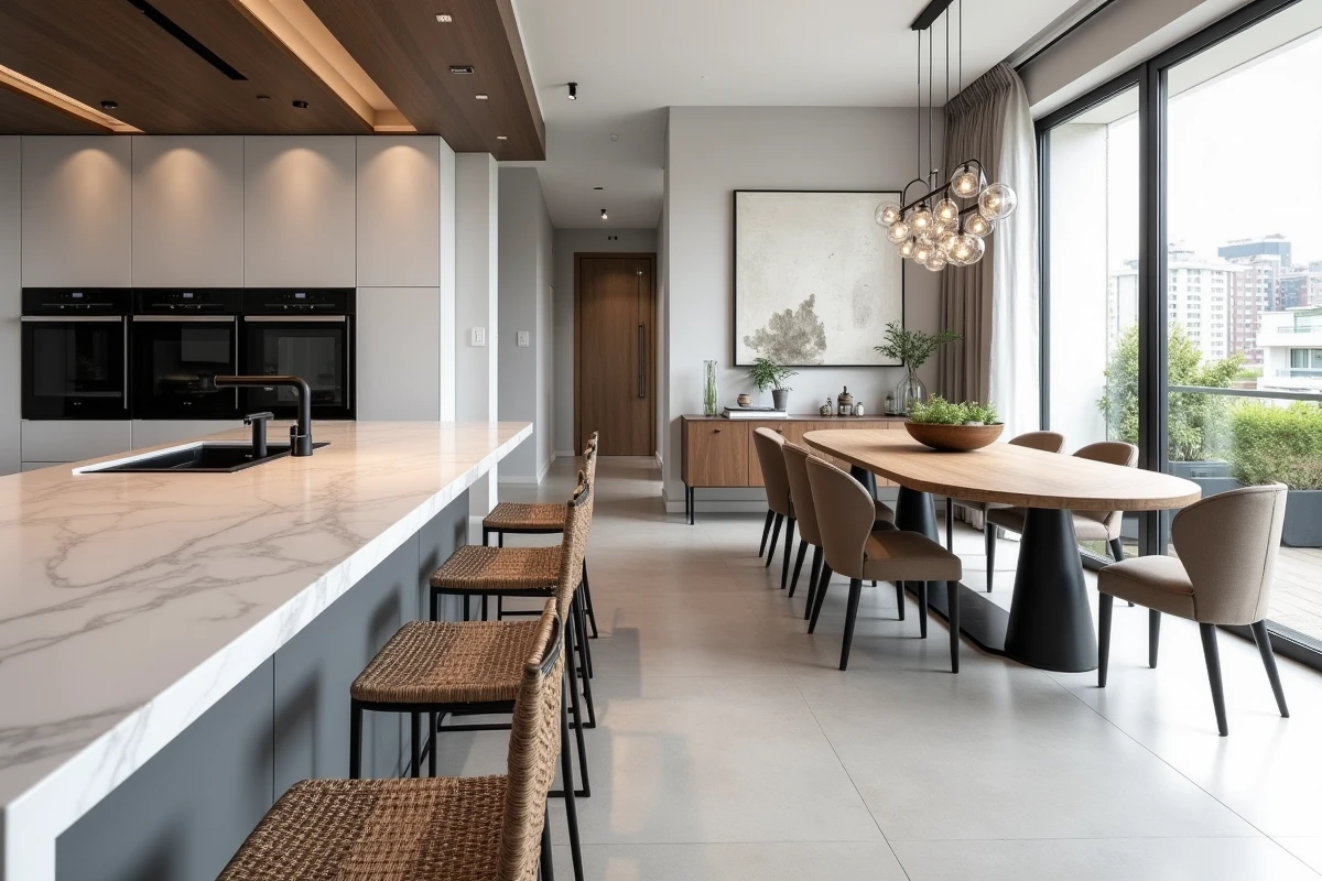
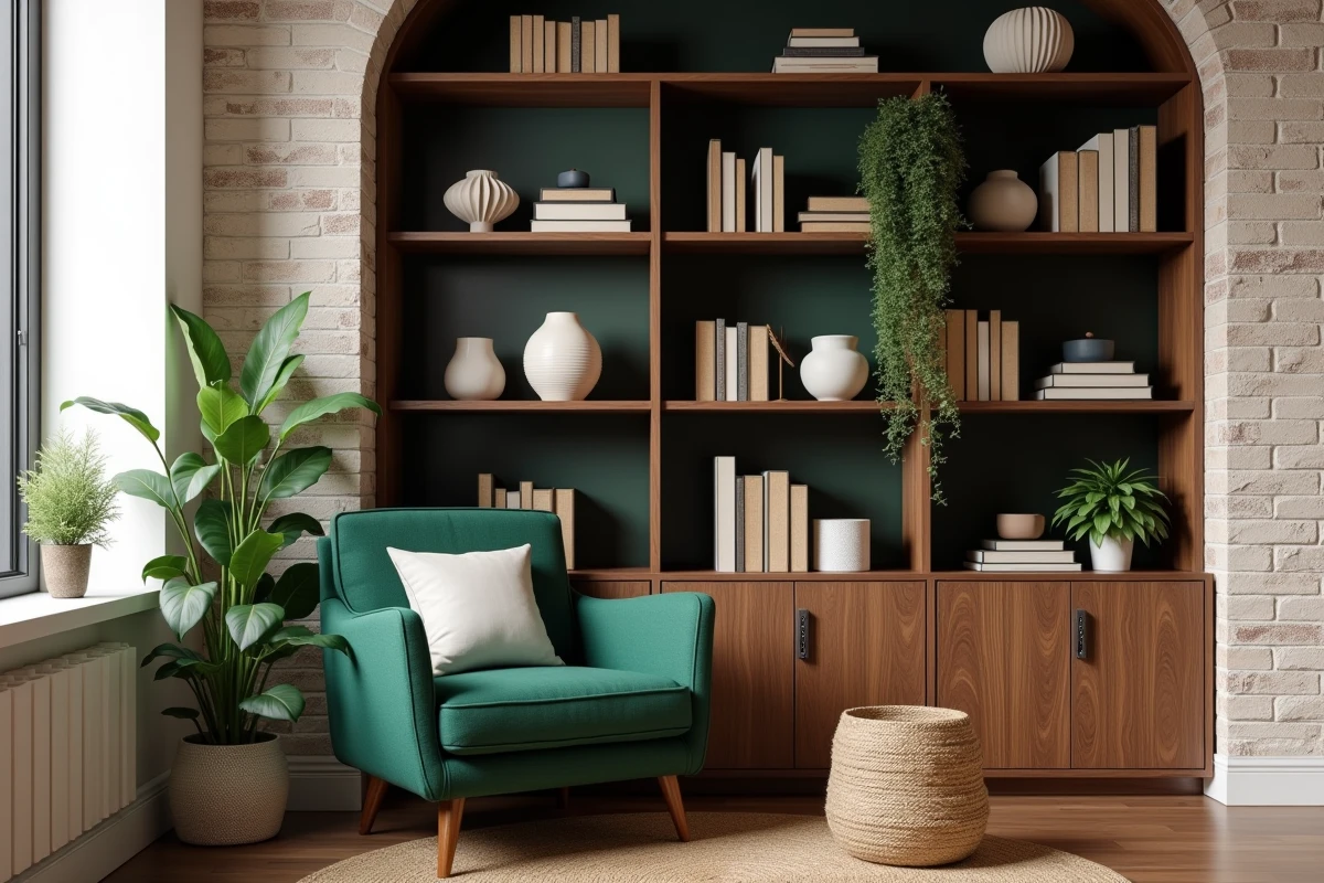
Style Consistency by Room: Kitchen, Living Room, and Bedroom Follow Different Rules
Applying the same decorative principle to all rooms produces a monotonous result. The kitchen, due to its intensive use and hygiene constraints, calls for smooth surfaces and colors that can withstand direct light. The living room, a space for extended stays, benefits from incorporating varied textures (rugs, cushions, curtains) that absorb sound and soften the atmosphere.
The bedroom presents a different challenge. The choice of colors in the bedroom affects sleep quality, placing decoration on a functional as well as aesthetic ground. Saturated tones or strong contrasts stimulate attention, which is the opposite of what this room requires.
- In the kitchen, prioritize furniture with matte fronts and stain-resistant countertops rather than fragile decorative finishes.
- In the living room, vary seating heights and light sources to create distinct zones within the same space.
- In the bedroom, limit furniture to the bare essentials and focus on indirect lighting placed at a low height.
Treating each room as an autonomous design project, with its own constraints of light, circulation, and use, yields a more refined result than applying a uniform “style” throughout the entire home. A coherent interior is not a uniform interior; it is a collection where each space fulfills its function without breaking visual continuity.